Just like a well-designed symbol quickly and effectively communicates a message, a good logo conveys a message about a company’s purpose or products and services. Through the use of colors, shapes and even techniques that tap into our subconscious, the best logos are usually simple, unique, memorable and adaptable to a wide variety of uses from letterheads and business cards to vehicles and billboards.
Lagoon’s current logo has been in use since 1989 — much longer than any other logo they’ve used during their 130-year history. There are a few reasons it has become a successful design. Not only is it familiar to just about everyone in the region, it also sums up visually what visitors from outside the area might expect to find at Lagoon.
THE EVOLUTION
A trend that started in the 1950s was to incorporate the park’s attractions into the composition of the logo. It worked well for many years. However, when Pioneer Village was added in 1976, combining symbols of both the rides of the Midway and the historical side of Pioneer Village in the logo presented a new challenge.
Another major addition to the park came in 1989 with the opening of the new Lagoon-A-Beach water park. Now the logo had to integrate three distinct areas. The result proved to be surprisingly clean and simple compared to previous attempts.
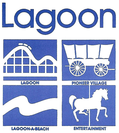
The typeface used was Avant Garde Gothic Medium, which was developed in 1970 from the logo of the short-lived Avant Garde magazine. Comprised of geometrically pure shapes, it provided the perfect basis for a simple logo. Inside the bowls of three of the letters are symbols of Lagoon’s three main areas.
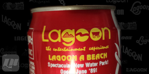
An early version of the logo used a roller coaster in the middle of the letter ‘g’. It was rarely used before the roller coaster was replaced by a carousel horse to represent the midway rides. The first ‘o’ had a wave for the new water park and the second ‘o’ contained a covered wagon for Pioneer Village. Perhaps the ‘a’ could’ve been set aside for a symbol of some future expansion, but none of the variations created since has used the letter ‘a’.
Nearly three decades later, the logo still works well, whether it’s on a ride vehicle, employee name tag, billboard or Facebook post. The nature of this logo allows for the symbols within it to be interchanged while remaining recognizable. When Space Scrambler was repainted in 2001, the back of each gondola featured a variation of the logo with a star, the planet Saturn and the sun. Around 2003, a Halloween version using a ghost, jack-o-lantern and a bat was used during Frightmares and a Christmas version was created to promote season passports as gifts.
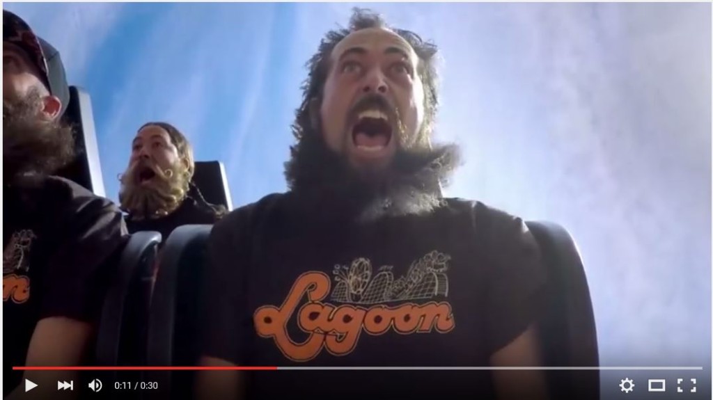
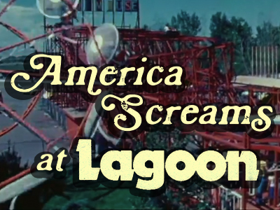
Something unexpected began popping up in November 2015. Advertising for the Black Friday Season Passport sale on TV and the park’s billboard on I-15 featured a group of bearded men on Cannibal wearing Lagoon shirts with a retro look. The nostalgic logo, originally used in the mid-1970s, appeared in social media in early 2016, then on season passes, employee name tags, park signs and more. Presumably a temporary alternative logo for the celebration of Lagoon’s 130th anniversary, the hand-drawn design helps remind guests of a simpler time in the midst of an increasingly complicated world.
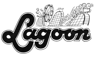
PAST LOGO DESIGNS
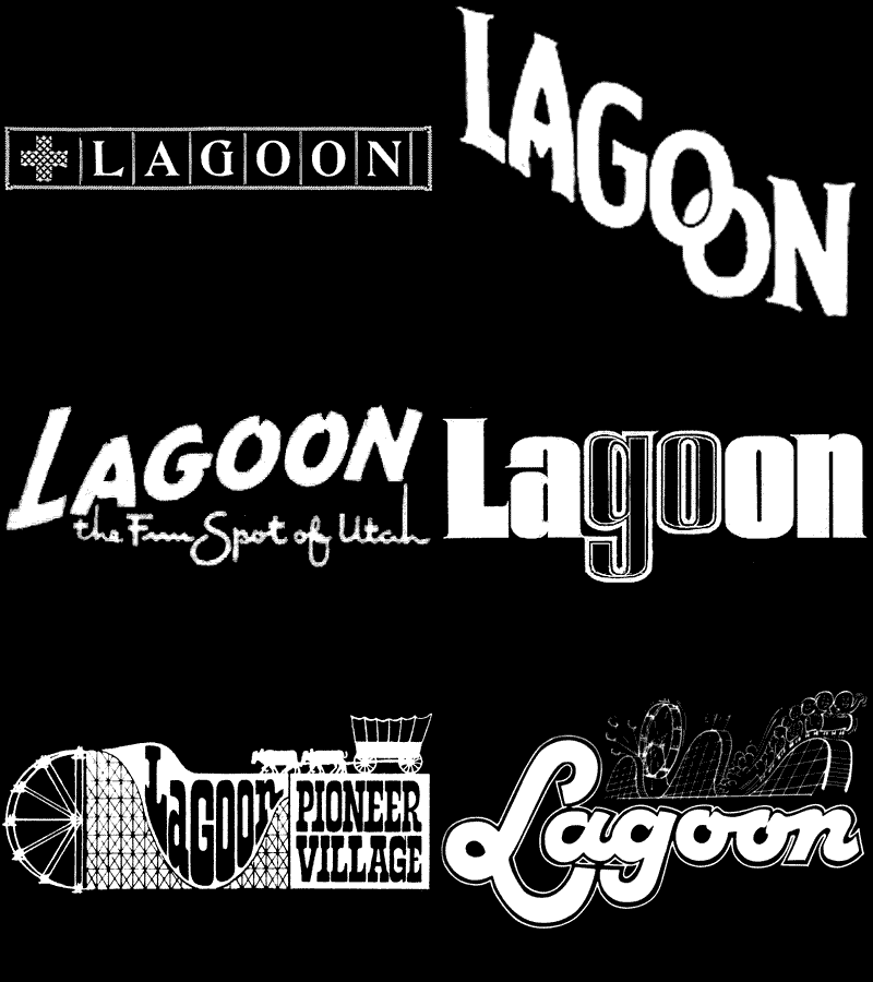
Through the first few decades of Lagoon and Lake Park, there doesn’t seem to have been an official logo, but it wasn’t a common practice at that time like it is today. The rise in popularity of corporate logos came with the rise of corporations themselves. In newspaper ads, the name ‘Lagoon’ was usually stylized or embellished in some way, but it often changed to fit different needs and specifications.
The first official (or at least consistently-used) Lagoon logo was likely the one created around 1920. The late 1910s and ’20s were a pivotal point in the history of the park as it shifted away from a resort for relaxing, socializing and enjoying the beauty of the gardens. New, mechanized amusement devices appealed more and more to those seeking unique thrills they couldn’t find in everyday life. The manager of the park during this time, A.C. Christensen, sought to emphasize these thrills at Lagoon and numerous modern thrill rides were added during his tenure including the Lagoon Dipper and the Captive Aeroplanes.¹

From then on, the Lagoon logo usually had a lighthearted, animated and relatively exotic style to reflect what the amusement park represented to its hard-working guests. It would be a long time before computers became the primary tool for designers. So, even when definitive logos were created, they were altered by hand to fit with an accompanying illustration or other purposes. There were numerous variations of the logos created from the 1920s to the 1940s. Sometimes different logos were used for different uses. For example, one might have appeared in print ads while another would be used for brochures.

Before World War II, Ranch S. Kimball was the accomplished artist on staff at Lagoon who designed the famous image of a bather in a goblet of water with the slogan “Swim in water fit to drink!” and designed the newspaper ads and signs around the park for years. Lagoon closed during the war and Ranch partnered with the Freed Brothers in 1946 to lease, fix up and reopen the park. The new logo he created that year was used more consistently across many mediums than those used in the past.

The park experienced a rebirth in 1954 after recovering from a massive fire during the off-season. Along with it came a new logo with the text “Lagoon” following the contour of a roller coaster hill. Over the next few years, that logo was coupled with a variety of attractions as they were added like the Patio Gardens, Mother Gooseland, Fun House, Showboat and more. It was simplified slightly in 1961 and that version was stylized further in 1968.
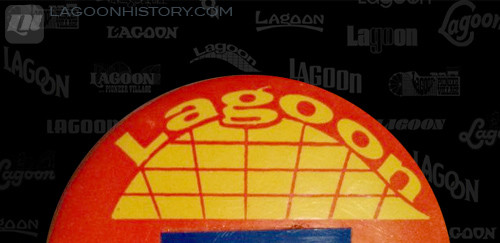

In 1971, a completely new design was created which emphasized a call to action that had been hidden in the name all along. Right in the middle of the word “Lagoon” is the word “go” which was just what Lagoon wanted people to do. The same device was recently used again for the “It’s Lagoon Time/It’s Go Time” marketing campaign in 2014.
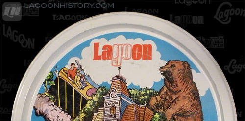
The logo changed frequently and erratically in the 1970s, much like in the decades before World War II. The introduction of Pioneer Village spurred many different designs. There were at least three or four different logo designs utilized in 1976 alone and earlier logos occasionally reappeared in odd places.
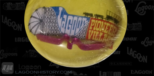
The 1977 Lagoon logo combined the Ferris Wheel, Roller Coaster and Ox-Drawn Wagon. It might have been the awkward, contrived look of it that led to much more streamlined designs in 1978 and 1980 which rarely consisted of much more than the name. The basic “Lagoon” logo would alternate with a “Lagoon and Pioneer Village” logo.

The 1980 logo, using the Stilla typeface (created in 1972), was placed on ride vehicles and the new electronic marquee installed near the Interstate in the mid-’80s. It may have been the first time a single design appeared on most of the rides and signage around the park. After the 1989 update, the 1980 logo was slowly replaced on ride vehicles and signs, but it can still be found on the cars in Terroride, on the side of Centennial Screamer’s gondolas, the exterior of the Fun House’s slide tower and on the front of the Opera House.²
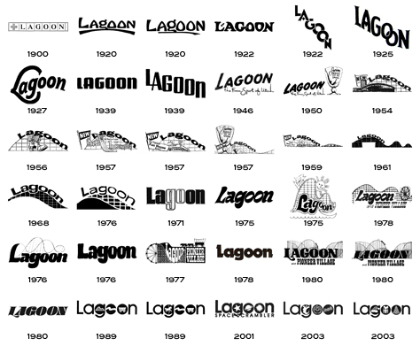
Shown above are some examples of graphic representations of the Lagoon name and logo from over the years. They are grouped together by the original design and variations of that design to show the transformation. The year below each design is the year it was first used, as far as I have been able to tell by looking through hundreds of newspapers, brochures and photos, so they are not all in chronological order.

NOTES
1. The Lagoon Dipper is known today simply as Roller Coaster. The Captive Aeroplanes later became the Rockets until it was removed in the 1980s. You can read more about the ride here.
2. Earlier evidence of this logo has since been discovered in a 1979 photo of Jet Star 2. Also, since this article was written, the instances where this logo can be found at the park have decreased even more. The sign from the Opera House was removed while the building was repainted and it never returned. The logo on the side of the Fun House tower slide was painted over in November 2017. However, when Paratrooper was repainted in 2018, the 1980s logo was added to the back of each seat – the first time it has been placed on a ride since 1987.

more from lhp

SOURCES
Freed Chavre, Jo Ann. The Bob Book: A Collective Memory of Robert E. Freed. Salt Lake City, Utah, 1999.
Redding, Dan. The Evolution of the Logo. Smashing Magazine, 6 Jul 2010.
Stilla & François Boltana. Typographics, accessed 16 Feb 2016.
ITC Avant Garde Gothic. MyFonts.com, accessed 16 Feb 2016.


3 replies on “A Closer Look At Lagoon’s Logo”
You’re missing one of the logos. There’s one on paratrooper that has an ice cream cone on it.
Awesome article — nice work collecting all of the old logos! I have to agree with your note #2: that 1980 logo (and even more so the three-shade 1987 logo) are classic Lagoon & childhood for me. As much as I love the retro logo they chose for the 130th, part of me almost wishes they’d have picked the ’80 one for the throwback. Thanks!
Great article. This website is the best one about Lagoon out there.
One comment about the website though. I would suggest centering the page on the screen.